April 29, 2020, 8:23 AM EST.
Pandemic Update: Coronavirus Data Improving – Influenza Affects More People
Multiple Charts Show Coronavirus Data Dramatically Improving
written by Net Advisor™
WASHINGTON, DC. Are we there yet? Data shows Coronavirus improving dramatically. It’s not completely over, but the direction is going were it should be. Data also shows Influenza (the Flu virus) is a bigger and wider health issue than Coronavirus in several key metrics.
This report has plenty of charts that you probably won’t see on many TV news channels, let alone on their own websites. For some hoping for a nationwide Ebola and the Plague with 20 million American deaths; we’ll, we are sorry to report, that the Coronavirus data is overall improving, and has been for several weeks.
Data Probably Not on Some TV News.
There are many people in politically-driven circles who just don’t want you to know what’s really going on. We researched the data from the same sources that talk about Covid-19 everyday: CDC, WHO, The COVID Tracking Project, Johns Hopkins University and others.
Much of the media talk is all about caution and keeping people in fear. Sure, we want to be prudent, but we don’t need to buy into fear.
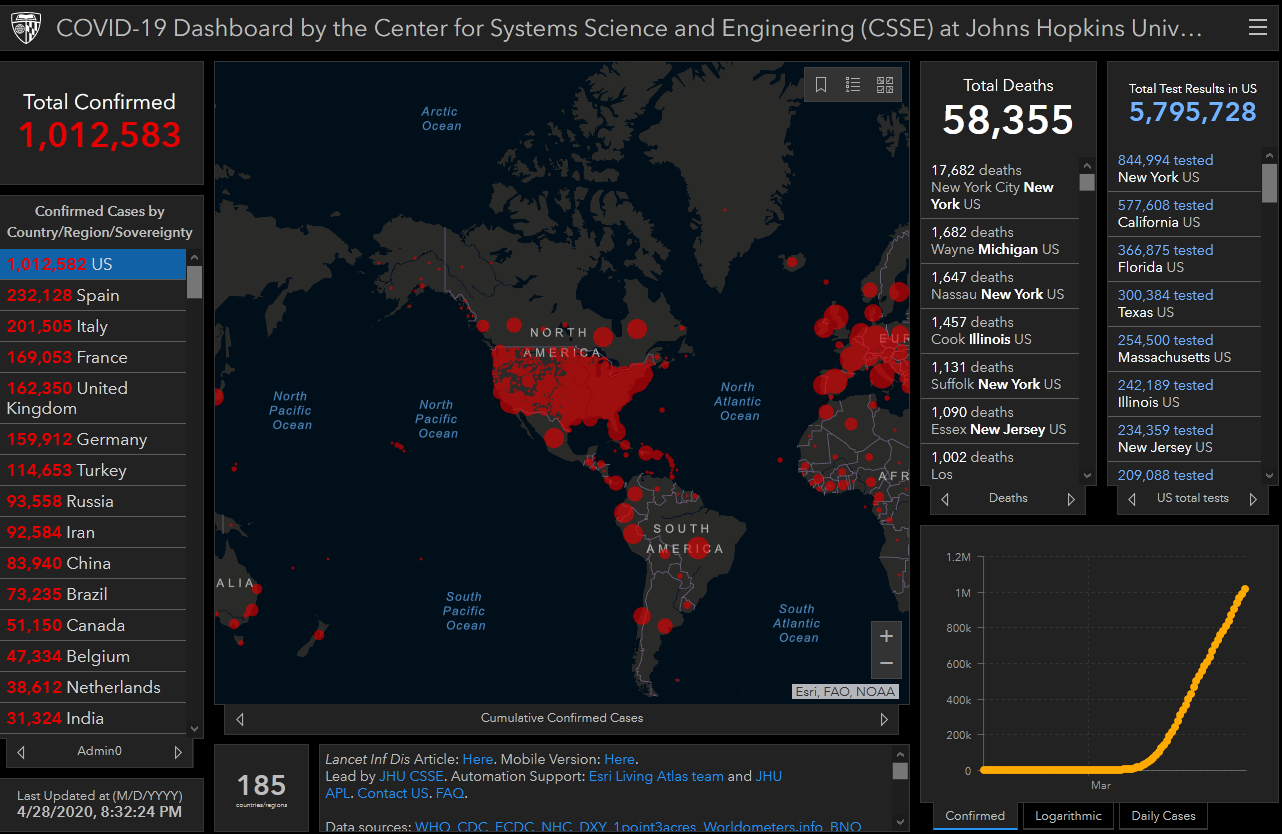
We’ll start with looking at the data from the Covid-19 Assault Map.
Covid-19 Assault Map.
We have called this the Covid-19 Assault Map since last month because of its scary features: Comes in Doom & Gloom gray and black with big red (blood-color) splashes. The data is useful, however there are some issues.
The map misleads users into thinking that virtually the entire USA is infected; when in fact it’s currently just over one million people who currently have the illness.
The U.S. has a population of about 331 million people; so the red blood-color splashes all over the map are not representative of actual scale. The ‘Assault Map’ makes things appear more dramatic, and that’s the impression some want you to understand.
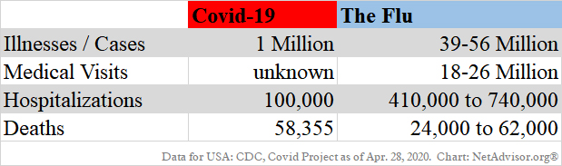
Covid-19 vs Influenza.
The flu (Influenza) season has infected far greater number of people in the USA than the novel Coronavirus (Covid-19).
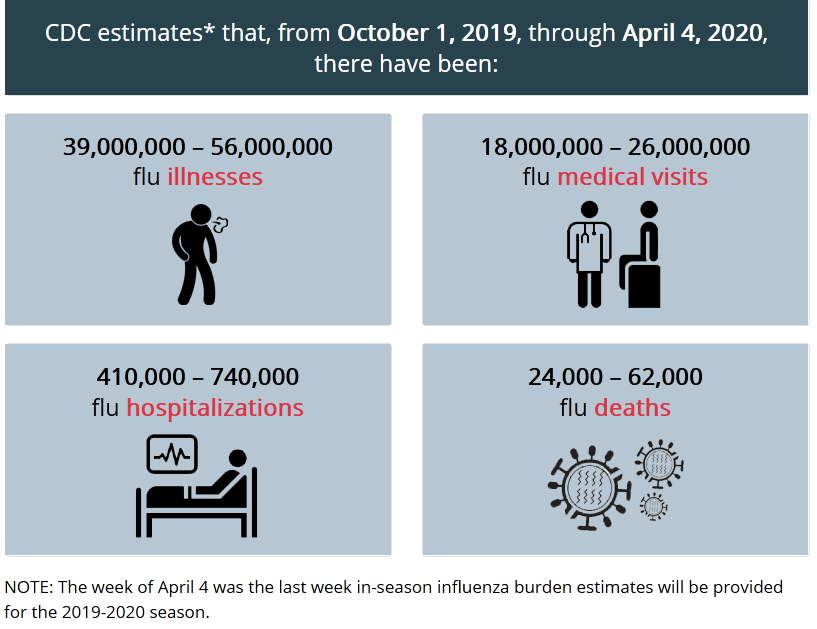
Illness Cases.
According to the CDC, for every one Covid-19 case, there have been 39-56 Influenza cases.
Medical (Doctor) Visits.
The number of medical (doctor) visits (not hospital visits) for Covid-19 seems difficult to pin down. Most of the data we looked at showed sample surveys. This really doesn’t tell us the total number of medical (doctor) visits. Part of this could be that not everyone is being tested for Coronavirus at the doctor’s office. This is just our guess. The data will mostly likely be compiled at a later date.
As for medical flu visits? A whopping 18-26 million people in the USA sought medical help (non hospital) for health issues related to the flu virus.
Hospitals Not Overran by Coronavirus.
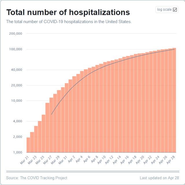
Hospitalizations.
There has been much talk in the media about how hospitals are over-ran, don’t have masks, gowns or other equipment all because of Coronavirus. The data just doesn’t support that argument.
The data shows that the number of hospitalizations due to Covid-19 is just around 108,000 people. Now compare this to the number of hospitalizations due to Influenza: The CDC estimates that 410,000 to 710,000 people have been hospitalized in the USA during the current Flu season. That’s 400% to 700% more than the number of people who have hospitalized for Covid-19.
Thus the data shows Covid-19 is not the reason for mass panic in hospitals. We think there is something else that that is going on that is left out of the news story. It could be that a particular hospital is disorganized to begin with. There are also reports of large furloughs of hospital workers which impacts staffing.
We did some digging, and here are some of the problems.
- Quorum’s 24 Hospitals Face Bankruptcy – Hospital chain was already on “shaky finances” (fiscally mismanaged) BEFORE Coronavirus.
- New Jersey Hospital Asks for Volunteer Employees to Accept Layoff.
- HCA Healthcare Inc., one of the nation’s largest hospital operators, has closed clinics and outpatient facilities and cut employees’ hours. “A family-medicine practice in Dallas furloughed a third of its staff. A major 48-hospital nonprofit system will put 700 workers on temporary leave.”
- St. Luke’s Hospital Issues Layoffs And Temporarily Cuts Hours.
- Iowa: Floyd County Medical Center asking for temporary layoffs during pandemic. So when the going gets tough, the tough quit, starting with the medical staff?
- Tennessee: Layoffs at Franklin hospital, 200 out of work.
- West VA. Hospital revenues down, so 100’s are laid off. Two other VA medical centers just closed. Another hospital losing $1 Million-a-day due to seeing less patients, and fewer elective surgeries.
- Thomas Health filed for bankruptcy in January 2020, and had nothing to do with Coronavirus.
- Arkansas: Northwest Arkansas hospitals furlough some staff, cut pay. They blame “unable to do most elective and non-emergency procedures.”
There are tons of similar articles like this. Some had financial problems long before Coronavirus. Many others stopped their regular business, preparing for the disaster (Coronavirus) that never happened as expected.
It’s not that hospitals are ‘over-ran,’ it’s that they cut staff. Since business management is not their expertise; the time to cut staff or employee pay, is not when you need them the most.
Let’s continue on some media’s next favorite subject.
Deaths.
Naturally, most people don’t want to die. But has humans, we don’t come with a warranty and we don’t know our expiration date. We will all eventually die of something, and we hope it is way later than sooner. Be that as it is, the number of U.S. Covid-19 deaths are currently reported to be 58,355. This number is expected to go up.
It seems we know the exact number of Coronavirus deaths at any given time. Yet, when it comes to the flu, there is a 38,000 person discrepancy. The flu death data currently shows 24,000 to 62,000 deaths in the USA for the current flu season. Why can’t the CDC get this data down to a single number like we can with Coronavirus? – Seems odd.
Pre-Existing Conditions.
Coronavirus has thus far shown to affect people with pre-existing conditions. In fact, the data shows that about 90% of those who contracted Coronavirus had a pre-existing condition.
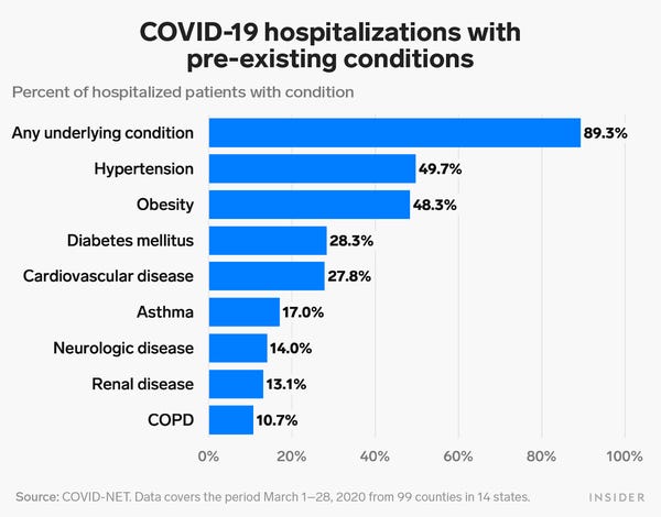
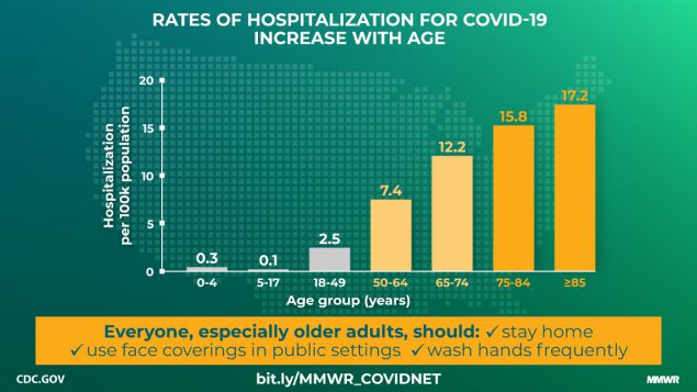
In fact of those hospitalized, 45.2% are over the age of 65. Those aged 5 to 17 years old seem to be at the lowest hospitalization category. It does not mean 5-17 year olds can’t get Coronavirus, but they are the least likely group to be hospitalized because of it. They are more likely to get the flu as above CDC data shows (page top).
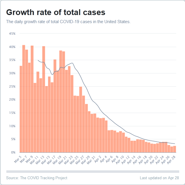
Growth Rate of New Covid Cases Plummeted.
The current data shows that the growth rate of new Coronavirus cases have plummeted since about Mid-March 2020.
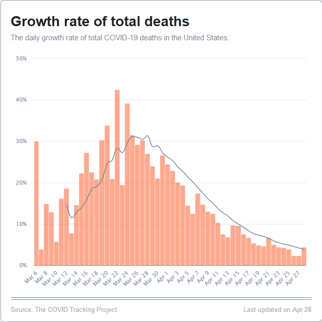
Growth Rate of Covid-19 Deaths Have Also Plummeted.
The current data shows that the growth rate of Coronavirus total deaths have also plummeted since about Mid-March 2020. Sure, everyday people die (of something), and everyday people are born. The good news is the rate of growth of those dying due to Coronavirus has dropped like a rock.
“The Curve” Has Been Flattened.
We hear as it seems all day, every single day about, we’ll, we can’t release you from “prison” (home quarantine – especially those of you are not sick at all) until the “curve” is flattened.
We’ll folks, you may not have seen this chart on some TV news channels. The data shows that the Coronavirus “Curve” began to flatten in early April 2020.
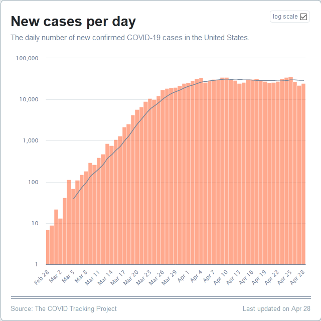
2020-04-28 The COVID-19 number of new individual cases in the USA began to flatten since early-April 2020 and thus far has relatively stayed that way all month. (Source: Covid Tracking project.)
Yes, for those of us who study charts and trend-lines, sometimes it’s difficult to say this is over. It could be a short-term trend or it could be the trend we have been looking for.
Trend & Analysis.
Performing analytics on charts and trend-lines, we can’t wait 6-12 months to develop a solid short-term trend; and we certainly can’t wait 3-5 plus years to develop an intermediate term trend. The U.S. economy would have long collapsed before a reliable short-term trend developed.
Here is the good news. There is this old saying in the financial markets and it can apply here based on current Covid-19 data:
“The trend, is your friend.”
— Old stock market adage when looking at trend analytics using period charts.
Some people might say, ‘what does stock trends have to do with Coronavirus.’ It doesn’t. Analyzing charts is looking at trend-lines over a period of time. Yes, it may be only 3 to 4 weeks of a trend, but thus far it’s the trend-line we have been looking for.
Sure, it will take some time to get life back to semi-normal. We’ll likely continue social distancing, wearing masks, gloves, more hand-washing (use lotion if they get dry). We’ll hopefully pay more attention to cleaning your residence and work spaces.
Remember to let the fresh air inside your residence. Sorry if you live in polluted Los Angeles or New York. Do the best you can. Maybe purchase a Hepa air-filter, clean or change it as necessary.
Talk to your professional medical advisor if you have indoor or outdoor allergies or have things that affect sinuses that can turn into a cold. There are plenty of over-the-country non-drowsy anti-allergy/ sinus products that can work. Again, talk to your doctor, pharmacist or other medical professional before using any new medication.
The media will report some more deaths today, tomorrow and until people have got board of the fear channel. Keep in mind, it seems no one will talk about the 22,000 people who die every day from tobacco-related illness, or that the top leading causes of death in the USA outnumber Coronavirus by a long shot.
Try not to freak out if the trend has little bumps or spikes. This is normal especially as people get to be reacquired with their environment and with each other again.
Looking Good.
So the data is looking good. It was not as bad as forecast by “experts.” Yes, experts can be wrong sometimes, but this big miss cost trillions of dollars in economic damage and repair. Hopefully, we’ll all be able to enjoy “economic intercourse” again soon!
Twitter link (if video not playing).
JOE BIDEN: “You’re going to not be able to have economic intercourse..”
— Breaking911 (@Breaking911) April 28, 2020
It’s time to get back to work.
Images/ graphic may be copyright by their respective owners.
Original article content, Copyright © 2020 NetAdvisor.org® All Rights Reserved.
NetAdvisor.org® is a non-profit organization providing public education and analysis primarily on the U.S. financial markets, personal finance and analysis with a transparent look into U.S. public policy. We also perform and report on financial investigations to help protect the public interest. Read More.
